If you’re searching for a neutral paint shade more pronounced than the simple gray but doesn’t tend to skew too much tan, consider opting for a taupe. Combining cool and warm hues lends itself to a wide range of design and architectural styles. It’s versatile and has an elegant look that can effortlessly blend into every color scheme. With so many shades of taupe paint available, choosing the best one for your home isn’t easy.
Experts from the design industry share their top taupe paint colors suitable for any decor style. Specific paint colors in the taupe family are warmer in red and pink undertones. Other colors have blue undertones that tend to be more cool hues. Certain taupes are deep and earthy, whereas others are refined and soft. They all have an enduring quality that can make any space look more elegant. If you’re thinking of the walls in your house, look fresh to these stylish choices.
Tina Ramchandani is an award-winning interior designer located in New York.
Sue Wadden is the director of marketing for color at Sherwin Williams.
Edgecomb Gray by Benjamin Moore
For a taupe to go with that is both modern and fresh, the interior design expert Tina Ramchandani suggests Edgecomb Gray from Benjamin Moore. “This is a favorite of mine. It’s taupe but it’s brighter and more refreshing than other taupes on the market,” she says. In contrast to some taupe paints, which can appear too heavy or muddy, this neutral is soft and calming. “Because of its airy quality, it remains a timeless color and I’ve been specifying it for years,” Ramchandani explains.
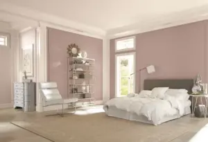
Poised Taupe by Sherwin-Williams
“Poised Taupe” from Sherwin-Williams gives an ideal blend of the two worlds – warm brown tones and cool gray tones. The color expert Sue Wadden calls it “a perfect example of a classic, warm neutral color with a modern twist.” This taupe paint color will quickly elevate an area and create an inviting, war, and cozy atmosphere. “Not cool or warm, nor gray or brown, Poised Taupe is a weathered, woodsy neutral that brings the sense of coziness and harmony people are seeking,” Wadden says.
Truly Taupe by Sherwin-Williams
Sherwin Williams’ Truly Taupe is the right choice if you’re looking for a calm, neutral color. Purple undertones provide depth to the taupe paint color, which makes it “a gentle and natural fit for making a space feel restorative,” Wadden says. You can use it to create the perfect bedroom oasis or a spa-like bathroom experience. Wadden highlights the color’s soothing qualities: “This warm neutral instantly washes over the room to create a sense of stillness where you can unwind from a long day.”
Tranquil Gray by Behr
Color specialist Erika Woelfel suggests Tranquil, Gray to create a serene and peaceful scene. It’s a medium-tone taupe paint color that’s elegant and neutral. “Behr’s Tranquil gray is a taupe-gray that offers the ease and comfort of a hot stone massage,” she declares. A delicate mix of cool and warm, the shade is adaptable enough for use in various rooms. “Tranquil Gray brings elegance to a corporate office or residential living space, while offering great potential for versatility,” Woelfel says.
Creamy Mushroom by Behr
Creamy Mushroom by Behr is a soothing and soft taupe paint shade that brings a warm and inviting hint of luxury. This soothing taupe is a beautiful shade with pink undertones that instantly fill the space with timeless elegance. It doesn’t matter if you’re looking to paint a cozy corner or bring a touch of elegance to your room; Creamy Mushroom can be a favorite taupe that will not disappoint.
Flatiron by Clare
It is named after the famous New York City triangular building, Flatiron by Clare, a modern version of taupe-colored paint. It is fresh and timeless. The hue changes in light and intensifies when the day begins to fade. The rich combination of gray and brown provides a luxurious look and makes it an elegant option for trim, walls, or millwork.
Weimaraner by Benjamin Moore
The space will be a little more grounded by embracing the earthy, warm hues of Weimaraner from Benjamin Moore, a deep taupe color that’s equally refined and calming. A smoky blend of gray and brown, It’s a warm hue that gives a tranquil and cozy feel. Its red, pink, and purple undertones provide this taupe with exceptional brightness and warmth, making it a perfect option for an area to gather. It can be used on the walls of your living space and in quieter rooms such as bathrooms and bedrooms.
Hardwick White No. 5 by Farrow & Ball
One of the main reasons for taupe’s popularity is that the mixed hue is an excellent match for many styles, spaces, and color palettes. Whether in a historical home or an urban condo, Ramchandani recommends Hardwick White in the collection of Farrow & Ball. “This is a deep taupe that doesn’t take on a tone, which I love,” she declares. “I’ve been able to pair this paint color with many schemes and it adjusts very well to each.” The shade can be a part of a range of styles for decorating. “It’s a little ‘chalky’ and works with both traditional architecture as well as modern styles,” she explains.