The world is abuzz with the trend for the color lavender. There’s no place you can go without spotting the beautiful hue, whether in home decor, clothing, or even the Lavender Haze drinks. The shade is fresh and airy and evokes a relaxed feeling whenever you consume it. Lavender is surprising, innovative, and highly versatile, so it’s not unusual that it’s dominating the charts for trends.
Lavender is an excellent choice for all rooms as it “often has a warm undertone, making it a mentally and physically soothing color,” says Tash Bradley, Lick’s director of Interior design and color psychology. She recommends using the color on every wall, especially in areas that require a tranquil style. Also, you can bring the color to the hallway for a warm welcome, lighting the dark, narrow room. The range of shades is from delicate, subtle pastels to more intense and hypnotic blue-purple hues; lavender is a refreshing alternative to classic blue or pink.
Bradley and other paint color experts give their opinions on the best lavender paint colors in every area to inspire your next room renovation.
Peignoir by Farrow & Ball
“Our delicate Peignoir is a pale lavender with a generous grey undertone,” says Patrick O’Donnell, international brand ambassador for Farrow & Ball. “Its gentle, muted qualities look wonderful simply teamed with clean Strong White on your trim and ceiling.” O’Donnell also suggests applying Peignoir on the ceiling, walls, and wooden work surfaces with Farrow & Ball’s latest Matte Dead Flat paint finish to create an illusion of cocooning. The color is excellent, with more intense lavender shades like Brassica for a tranquil color scheme or darker hues like Inchyra Blue to create a higher contrast.
Wallflower by Sherwin-Williams
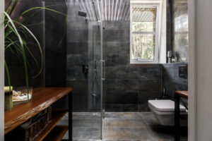
Wallflower SW 6281 is a delicate, light lavender hue with warm red undertones that effortlessly balance the calm and fun energy. “This particular hue goes well in a bathroom or any small space that needs a bit of re-energizing and vibrance,” says Sue Wadden, director of color marketing at Sherwin-Williams. She suggests pairing it with classic white paint like the Snowbound SW7004, creating an airy, light look within a small space.
Purple 06 by Lick
” Purple 06 is a color that has a similar tone to dusk on a summer’s evening,” Bradley states. Purple and pink mix in this shade of lavender to create the perfect comfort shade, with warm softness that will make you cozy retreat from your home. “Lavender is such a pretty color that’ll compete against pink, a perennial favorite,” she says. “Whenever I show my clients Lick’s Purple 05 or Purple 06, lavender quickly becomes a favorite, particularly as it is a more creative color.” She suggests pairing it with teal, blue, green, pink and blue. Beige and lavender also are a striking combination of colors.
Brassica by Farrow & Ball
“At the deeper end of the lavender spectrum, shades like our moody Brassica lend a touch of cozy sophistication to a room with its wonderful smoky notes,” O’Donnell explains. The shade adds warmth and a touch of elegance to a bright and airy space while also bringing warmth to rooms facing north without becoming too red. If you want a soothing palette, pair it with a subtle and soft brown neutral, like The Skimming Stone, and make it fun for the flooring by painting it with a lavender hue. “For colorful pairings, think blues or other purple tones and avoid pairing with yellows or anything too red as this can end up feeling rather kitsch,” the designer suggests.
Gentle Violet by Valspar
If you’re looking for a purple hue that isn’t quite as purple, Gentle Violet is a sophisticated and youthful subtle shade. “The softened lavender hue embodies harmony and connectivity with natural and artificial colors, setting new trends with the younger generation,” says Sue Kim, director of color marketing at Valspar. Being a part of the color family called purple lavender is associated with spirituality, imagination, and emotional sensitivity, which makes it the perfect background for areas designed for relaxation, such as a yoga or meditation space, as well as a reading space or bedroom.
New Age 1444 by Benjamin Moore
” New Age 1444 is a soft and ethereal pale lavender shade with a hint of gray that emanates a spiritual sensibility,” says Andrea Magno, director of color development and marketing of color marketing and development at Benjamin Moore. “This hue brings a soothing feel to a room in a subtle way that does not overpower and allows for layering other colors,” Magno says. Shades of lavender with gray undertones offer a more neutral, contemporary, versatile look and work well with neutral hues like white, dark grays, and steely blue-green shades.
Lavender Cloud by Behr
Lavender Cloud is an intense, mid-tone lavender color that encourages creativity. It’s an excellent choice for accent colors to highlight your room’s finest features. “Pair it with complementary colors in the blue family, like a bright Caicos Turquoise,” advises Erika Woelfel,, vice president of colors and services creative at Behr. Or, go monochrome by pairing it with a lighter lavender shade.
Tranquil Sea by Dunn-Edwards
Tranquil Sea (DE5932) is an ethereal, pale grayed purple color with a blue undertone. Its fantastic, ghostly cast is perfect for cooling down a hot, sun-splashed south-facing space. “Tranquil Sea is a misty hue that channels comfort and tranquility into any space,” says Sara McLean, color expert at Dunn-Edwards. Pastel hues, such as lavender, are the most popular for a vintage-inspired and cottage-core style and are great with pastel shades and lighter gray hues. “For a more modern approach, try pairing Tranquil Sea with orange and navy blue accessories to create a bold statement,” McLean adds.
Magical by HGTV Home by Sherwin Williams
Magical HGSW6829, a color from the Bold Simplicity Color Collection, is an exquisite lavender shade with warm undertones. “The duality of the Magical shade makes it a wonderful option for multifunctional spaces,” says Ashley Banbury, color marketing manager at Sherwin-Williams’ HGTV Home. On the one hand, lavender is connected to imagination, creativity, and the performing arts, making it ideal for spaces at home trying to ignite imagination and spark conversation. On the other hand, the warm undertones of this shade create a friendly, inviting atmosphere. Comfortable and, most importantly, restful.